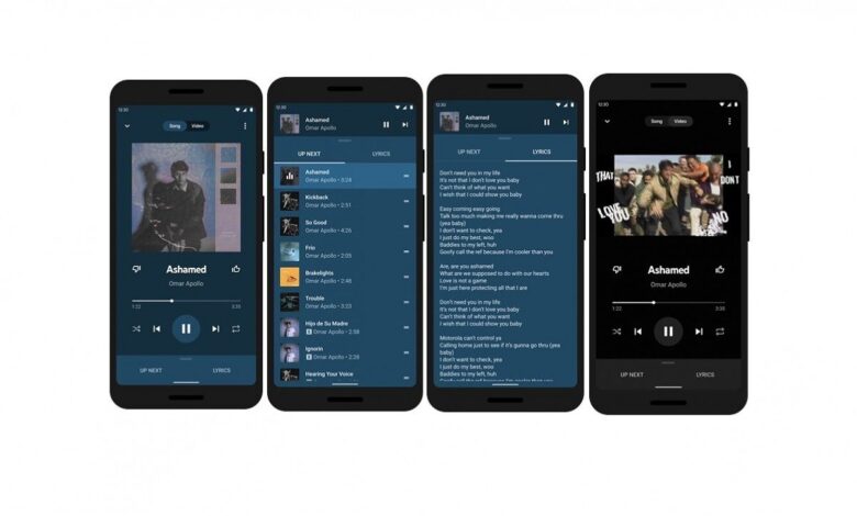
YouTube Music is shifting one of its most used controls into a more reachable spot, and that change is starting to alter how the app feels on large phones. Search is moving from the top-right corner to the bottom navigation bar, giving it a much more prominent place in everyday use.
The redesign replaces Explore in the bottom bar, while the top-right area is now occupied only by the profile icon. That makes Search easier to spot and faster to tap, especially for users who rely on one-handed navigation.
A more direct path to search
In the older layout, YouTube Music’s bottom bar included Home, Samples, Explore, and Library. With the new arrangement, Search takes the place of Explore as the main bottom-bar icon.
That change matters because Search is one of the app’s core actions. It is the quickest route to songs, albums, artists, and podcasts, so bringing it lower on the screen removes a small but noticeable stretch for the thumb.
The new placement also makes Search feel more central to the app’s design. Instead of sitting as a secondary action near the top edge, it now stays visible in the navigation row at all times.
Useful, but not fully one-handed yet
The move does improve the first step of searching. On bigger phones, reaching the bottom of the screen is far easier than tapping an icon in the upper corner.
Even so, the redesign does not make the entire Search experience fully one-handed. Once a user starts typing, reaching results, suggestions, or closing certain overlays still involves moving farther up the display.
That means the benefit is real, but limited to the opening stage of the task. The interface becomes easier to start using, while parts of the flow still require extra reach.
Explore still exists inside Search
YouTube Music is not removing Explore completely. Instead, the discovery tools that used to sit in its own tab now appear deeper inside the Search page.
After opening Search and moving past recent searches, users can still find dedicated discovery chips such as New releases, Charts, Moods & genres, and Podcasts. The app is keeping the same content discovery functions, but relocating them into a more search-focused path.
This makes the bottom navigation simpler. Search becomes the main gateway, while Explore turns into a more integrated layer within that experience.
Gradual rollout on Android and iOS
The new layout has begun appearing in YouTube Music version 9.21 on Android. On iOS, the same design is reported to be showing up in version 9.22.
The rollout does not appear to be universal yet. Some users on those versions still do not see the change, which suggests a staged server-side release rather than a full launch all at once.
That approach is common for Google app interface updates. For users who have not seen the new placement yet, the change may simply arrive later as the rollout expands.
Source: www.androidpolice.com