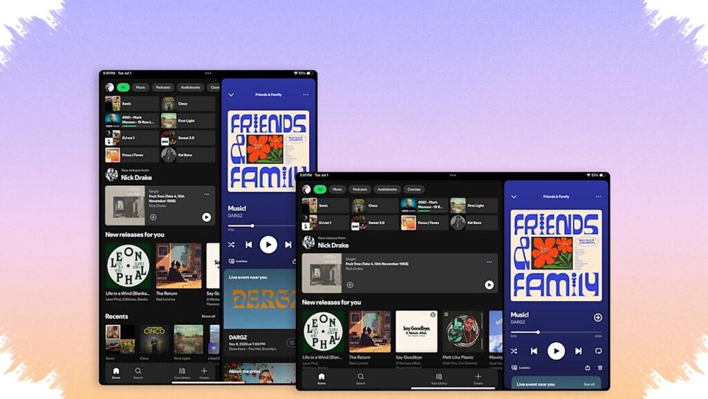
Spotify is starting to treat Android tablets and iPad as a separate experience rather than a simple stretched version of the phone app. The update brings a layout that is more suited to large screens, with clearer navigation, more flexible panels, and easier access to video features.
The change matters because tablet users have long seen Spotify behave like a blown-up mobile interface instead of an interface designed for wider displays. According to Android Authority, the new design is now rolling out and aims to make the app feel more natural on tablets without forcing users to relearn everything.
A tablet layout that reacts better to the screen
One of the biggest changes is how Spotify now adapts to screen orientation. When the device switches between portrait and landscape, the interface responds more intelligently instead of simply stretching the same layout.
That means the available space is used more effectively. Playlist pages, album views, and the now-playing screen appear cleaner, with less crowding and a better sense of structure on larger displays.
Sidebar changes make multitasking easier
The new tablet experience also introduces a sidebar that can be collapsed or expanded as needed. This gives users more control over how much of the screen is devoted to browsing and how much is reserved for playback.
- Keep the sidebar open when searching for new content.
- Collapse it to focus on the current track or podcast.
- Expand it again to browse interactive lists.
- Move between content without leaving the playback screen.
This approach fits the way tablets are often used for entertainment and light multitasking. Users can keep music or podcasts running while still moving through Spotify’s catalog in a more practical way.
Video access is getting more visible
Spotify is also making the “Switch to Video” option easier to reach in the redesigned interface. That is a notable shift because the company has been pushing video more actively inside the app.
With a clearer placement, the move from audio to video takes fewer steps. On tablets, where screen space is less limited, the feature feels more obvious and easier to use during everyday browsing.
What changes and what stays familiar
Even with the new layout, Spotify is not overhauling the entire app. Android Authority notes that most of the core elements still feel familiar, which should help existing users adjust quickly.
Here is a simple overview of the main updates:
| Area | What changed |
|---|---|
| Layout | Built specifically for tablets |
| Orientation | Adjusts better in portrait and landscape |
| Sidebar | Can be collapsed or expanded |
| Browsing | Works while playback continues |
| Video | “Switch to Video” is easier to access |
That balance between familiar controls and a smarter layout is important. It lets Spotify improve the tablet experience without making the app feel unfamiliar to long-time listeners.
The update is already being reported as live on Android tablets and iPad, so users who have received it should notice the difference immediately. For tablet owners, Spotify now looks much closer to an interface designed for the device itself rather than a phone app stretched to fit a bigger screen.