

Xiaomi’s latest beta keyboard update has given the first clear visual hint of HyperOS 4, and the changes point to a major shift in the company’s design direction. The update, released on March 30, 2026 for Xiaomi 17 devices in China, does more than refine typing tools because it introduces a new interface language that looks closer to a premium, layered system design.
The most notable signal is the arrival of an “Advanced Material” style that uses frosted glass effects, rounded corners, and floating panels. For users and analysts watching Xiaomi’s next software release, this beta offers an early look at how HyperOS 4 may reshape the entire system UI.
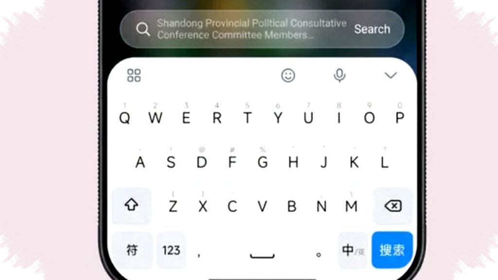
A beta keyboard that reveals more than typing tools
The keyboard update is not just a minor input patch, and that is why it has drawn attention from the Android and Xiaomi community. It changes the visual structure of the keyboard interface in a way that suggests Xiaomi is testing a broader design refresh before HyperOS 4 reaches stable release.
Beta software often exposes ideas that later appear across the main operating system, and this case follows the same pattern. Because the keyboard is a core system app, any major redesign inside it often reflects the visual principles that will spread to other parts of the platform.
What changed in the new design
The leaked look centers on a more elegant and layered visual style, with effects that add depth instead of flat blocks. Xiaomi has moved away from the simple, flat UI elements it used in earlier builds and toward a softer interface with more separation between layers.
Here are the main changes seen in the beta update:
- The keyboard background now supports a frosted glass effect.
- UI elements use more rounded corners across menus and toolbars.
- The AI toolbar appears as a floating card rather than a rigid strip.
- The overall interface feels more transparent and spatial.
- The layout suggests a stronger focus on visual consistency across system apps.
These changes may look cosmetic at first, but they often shape how users experience every interaction on the device. A more polished visual style can make system apps feel faster, cleaner, and more premium, even when the underlying performance remains unchanged.
Why the “Advanced Material” effect matters
The feature called “Advanced Material” is the clearest clue in the beta. When enabled, it adds a Gaussian blur effect behind the keyboard, creating the look of frosted glass that allows background content to remain visible but softened.
This design choice has become increasingly common in modern UI systems because it adds depth without overwhelming the screen. It also improves hierarchy, since foreground panels stand out more clearly when the background is blurred and de-emphasized.
Xiaomi appears to be using this effect to make the keyboard feel less like a separate block and more like part of the overall screen. That direction suggests HyperOS 4 may aim for a more fluid and unified interface, where menus, panels, and controls blend together naturally.
AI tools are moving into the foreground
The beta update also shows Xiaomi putting AI features directly into the floating toolbar, which is a practical move for everyday use. Translation tools and AI conversation options now appear in the same accessible area as other input functions, reducing the need to dig through deeper menus.
That matters because AI features are only useful when users can reach them quickly. By placing them in a customizable floating toolbar, Xiaomi is making the keyboard not only more attractive but also more functional in daily tasks such as writing, translating, and editing text.
This kind of integration also shows how Xiaomi is positioning AI as a normal part of the interface rather than a separate feature layer. The design keeps the tools visible and ready, which can help users adopt them more often.
Why this beta may reflect the larger HyperOS 4 direction
A redesign inside a system keyboard usually points to broader plans for the operating system, and Xiaomi has a history of testing visual ideas in key apps before expanding them. That means this beta could be an early preview of a full HyperOS 4 design language built around depth, blur, and smooth motion.
If Xiaomi applies this same philosophy system-wide, users may later see similar effects in the Control Center, notification shade, and built-in apps. The use of real-time blur and softer card-style panels could make the whole system feel more modern and consistent.
Below is a simple look at where these design elements could appear if Xiaomi expands the beta direction across HyperOS 4:
| UI Area | Possible HyperOS 4 Change |
|---|---|
| Control Center | Real-time blur and layered tiles |
| Notification panel | Softer transparency and rounded cards |
| System apps | Unified frosted material design |
| Setup menus | Cleaner spacing and modern navigation |
| Keyboard and toolbar | Floating layout with AI shortcuts |
This table is speculative, but it aligns with the direction signaled by the beta keyboard. It also reflects a common pattern in mobile software development, where one app becomes the testbed for a wider visual overhaul.
How this compares with modern mobile design trends
Xiaomi is not working in isolation, and the new beta design fits a broader industry trend toward depth-based interfaces. Apple, Google, and other major platform developers have all explored variations of blur, transparency, and rounded surfaces to make software feel more polished and less visually heavy.
The resemblance to iOS-style frosted glass is especially noticeable, although Xiaomi still gives the interface its own structure. The goal appears less about copying and more about adopting a design language that users already associate with modern premium devices.
That approach can be strategic for Xiaomi, especially as it continues to compete in the flagship segment. A more refined visual identity helps the brand present HyperOS as a serious platform, not just a skin with feature upgrades.
What users should watch next
The keyboard beta is likely only one stage in a larger rollout, and future test builds may reveal even more about HyperOS 4. If Xiaomi continues the same design direction, the next signs may appear in system apps that manage notifications, settings, and multitasking.
For now, the beta already tells a clear story about Xiaomi’s priorities. The company seems focused on a cleaner, more sophisticated interface that combines AI access, visual depth, and smoother interaction in one package, and the keyboard leak may be the first real preview of how HyperOS 4 wants to look and feel when it reaches users.