

A small detail on the Grand Theft Auto cover art has drawn fresh attention after fans lined up every main series cover from GTA III to GTA VI. The pattern is simple but easy to miss: a helicopter keeps appearing in the top-left corner.
The discussion began with a Reddit post by user u/Tejas_008 in the r/gaming subreddit. That comparison image quickly sparked debate about Rockstar’s visual identity, recurring design choices, and the elements the studio appears to preserve across generations.
A visual signature that spans the series
Many fans said they had never noticed the helicopter placement until the covers were placed side by side. The observation turned into a broader conversation about how Rockstar builds a recognizable look for GTA without changing the core formula too much.
Commenters noted that the recurring helicopter is not just an isolated coincidence. One user, u/Zjoee, pointed out the pattern with a joking tone, while others admitted the detail had escaped their attention for years despite their familiarity with the franchise.
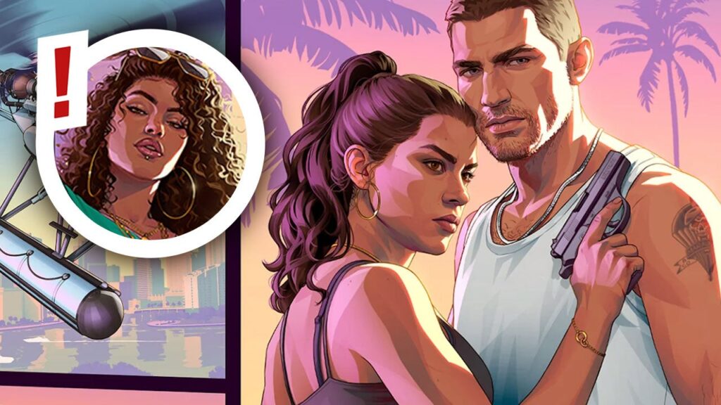
More than one repeated element
Some fans went further and described the wider visual formula they see in the artwork. One commenter, u/OneRandomVictory, summarized it as “sexy girl on the left, man carrying a gun at the bottom, helicopter in the top left, bike or scooter in the top right, luxury car at the bottom, and the main character at the top center.”
That breakdown shows how the covers have developed a language of their own. Even when the style changes from one era to the next, the artwork still carries familiar building blocks that keep the series instantly recognizable.
Which cover fans like most
Among the covers discussed, GTA San Andreas received the strongest praise. Many users called it the best-looking entry in the series, citing the orange sky, Grove Street references, and the strong sense of nostalgia.
Vice City also earned a lot of appreciation for its distinctive 1980s color palette. GTA IV, meanwhile, was seen as taking a more realistic approach that sits between the older comic-book style and the newer, more modern presentation.
The reaction also highlighted how strongly Rockstar’s branding still resonates with players. One user, u/Kymmieuwu, said the consistency was impressive and described Rockstar’s brand identity as something that should not be changed.
The renewed attention comes as interest in GTA 6 continues to grow, but the cover-art discussion has shown that older design details still matter. For many fans, the helicopter in the top-left corner is no longer just background decoration, but a visual thread linking GTA III through GTA VI.