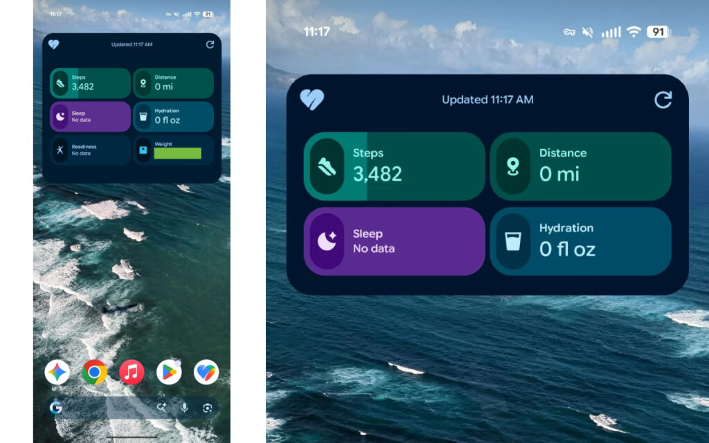
Android users are starting to see a very different face for Google Health, and the biggest change is not hidden inside the app. It appears directly on the home screen through a new Quick Access widget that can show up to six health metrics at once.
That shift makes the app feel less like a place to check a single daily stat and more like a compact health dashboard. For users who previously relied on the older Fitbit-style widget for step counts, Google Health 5.0 brings a far more complete snapshot without needing to open the app repeatedly.
A larger widget with more useful data
The new Quick Access widget replaces the older circular Fitbit widget that only showed step data. Instead of focusing on one simple metric, it mirrors the featured content shown at the top of the Today tab inside the app.
By default, the widget comes in a 5×3 size. In that layout, it can display as many as six health metrics side by side, giving users a broader view of their daily activity and wellness data from the home screen.
Google also added more flexibility to the widget itself. Users can remove certain elements, including the Weekly cardio ring, or shrink the widget if they want a cleaner and more compact layout.
A visible step in Google’s Fitbit rebrand
The update is also part of Google’s broader move away from Fitbit branding in its main health app. Fitbit names and branding have been removed from the app and replaced with Google Health identity elements.
That change fits Google’s earlier plan to shift the Fitbit name toward hardware while the app moves under a more unified Google Health label. Fitbit branding remains in use for hardware products, including the newly launched Fitbit Air.
The result is a cleaner interface and a clearer separation between the app experience and the hardware brand. For users, the most obvious sign of that transition is the updated icon and the refreshed look of the app.
Faster access from the home screen
The new widget does more than display additional data. It also changes how users move through the app from the home screen.
Tapping the heart icon now opens the full app immediately. A tap on the right side instead takes users directly to Health Coach, which is designed to speed up access to the two areas most likely to be used often.
This small navigation change matters because it reduces the number of steps needed to reach key sections. Google appears to be building the app around quicker, more direct access rather than forcing users to dig through menus.
Still in public preview for some users
Even though Google Health 5.0 has started rolling out through the Play Store on Android phones, the new interface is not yet the default for everyone. Users who want the updated UI still need to join the Public Preview program inside the Fitbit app.
That means the rollout is still in transition, and the change has not fully reached every account. The new look is also described as still feeling slightly unfinished, which suggests more refinement may come before the migration is complete.
Google is allowing users to move between the old and new interfaces during this period. That approach gives people time to adjust to the redesign without being forced to abandon the familiar layout immediately.
Rollout is moving gradually across Android
The rollout began on 19 May 2026 for Android smartphones and is expected to reach more devices by 26 May 2026. As with many app updates, availability is arriving in stages rather than all at once.
For Android users, the most noticeable change is likely to be the home screen widget itself. Instead of a single step counter, Google Health 5.0 turns that space into a more informative snapshot of daily health data.
Source: gadgets.beebom.com