Motorola is taking an unusually strict approach with the Razr Plus 2026. Instead of offering multiple finishes, the clamshell foldable arrives in just one official color, and that single choice is already shaping how the device will be perceived.
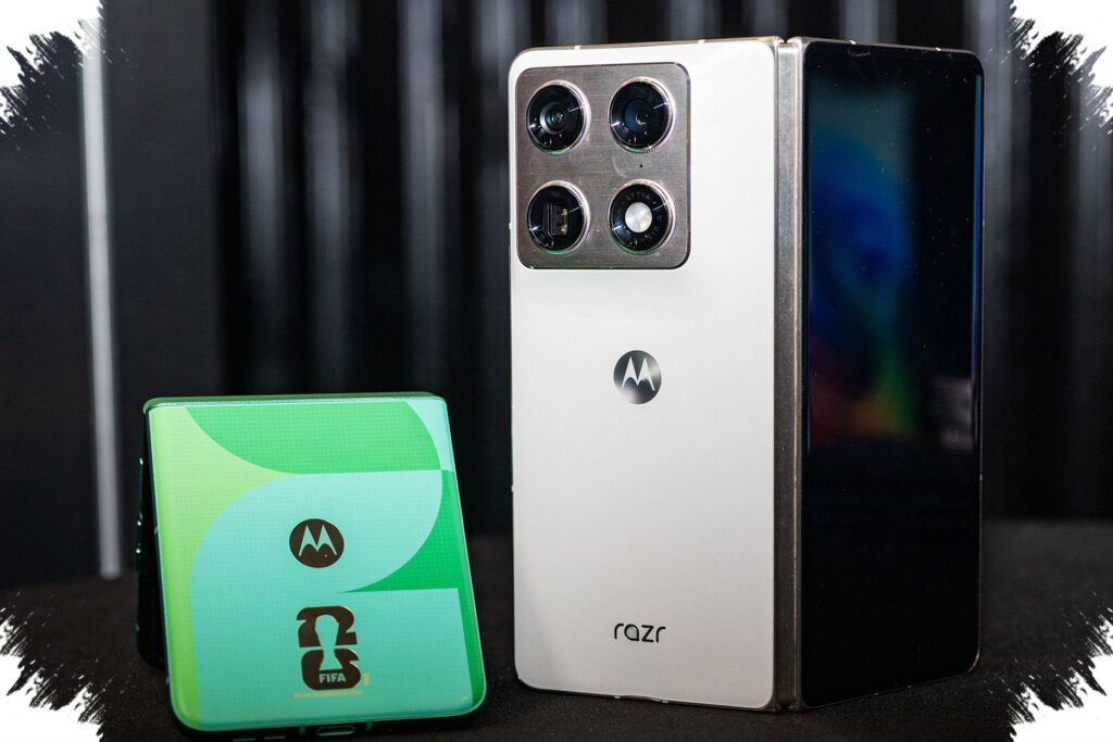
The color is PANTONE Mountain View, a deep green with forest-like character and olive undertones. It gives the Razr Plus 2026 a strong visual identity, but it also removes the usual freedom buyers expect from a premium phone.
A single finish, not a full palette
For a device in this class, the lack of variety stands out. The Razr Plus 2025 came in three colors, so the move to one shade for the Razr Plus 2026 is a sharp shift in direction.
Motorola is not keeping any of the earlier palette choices either. There is no pink, blue, or brown option on this model, which means the phone’s appearance is now defined almost entirely by Mountain View.
That choice makes the Razr Plus 2026 easier to recognize. It also makes it far less flexible for buyers who usually use color as part of the decision-making process.
The finish does more than change the look
The green tone is paired with a woven jacquard-style back panel. That texture adds a fabric-like effect that gives the phone a more premium feel than a plain glossy surface.
The finish also improves grip. That matters on a foldable phone, especially one that is likely to be handled with one hand in everyday use.
The textured back does not replace protective accessories, though. A case and screen protection still remain relevant for normal use, even with the more tactile finish.
Why the choice matters
This design decision is more than a cosmetic detail. It shows that Motorola is pushing a very specific identity for the Razr Plus 2026 rather than trying to appeal through variety.
PANTONE Mountain View is not a neutral, safe option. Its dark green tone and olive character make it feel more adventurous and less conventional than the kind of colors often used for premium devices.
That can work in its favor with buyers who want something distinct. It can also work against it for shoppers who prefer to match a phone more closely to their personal style.
Where the Razr Plus 2026 sits in the lineup
The Razr Plus 2026 is positioned in the middle of Motorola’s Razr 2026 family. It is meant to deliver a flagship-like experience in the clamshell foldable segment without going all the way to the top model.
That middle position makes the limited color strategy feel even more noticeable. The device may offer a premium experience, but on personalization it is one of the most restricted options in the lineup.
For buyers who do not like Mountain View, the practical alternatives are limited. They would need to move to another Razr 2026 model or cover the phone with a case to change its appearance.
A design strategy with a clear trade-off
Motorola’s decision suggests confidence in a single visual direction. A one-color launch can help the phone stand out more clearly in a crowded market and give it a stronger identity.
At the same time, it narrows the appeal for people who treat color as a major part of a foldable phone purchase. The Razr Plus 2026 is therefore not only a hardware choice, but also a test of how far a brand can push a single aesthetic.
For some buyers, the simplicity will be welcome. For others, the answer to the color question will feel very final: PANTONE Mountain View, and nothing else.