
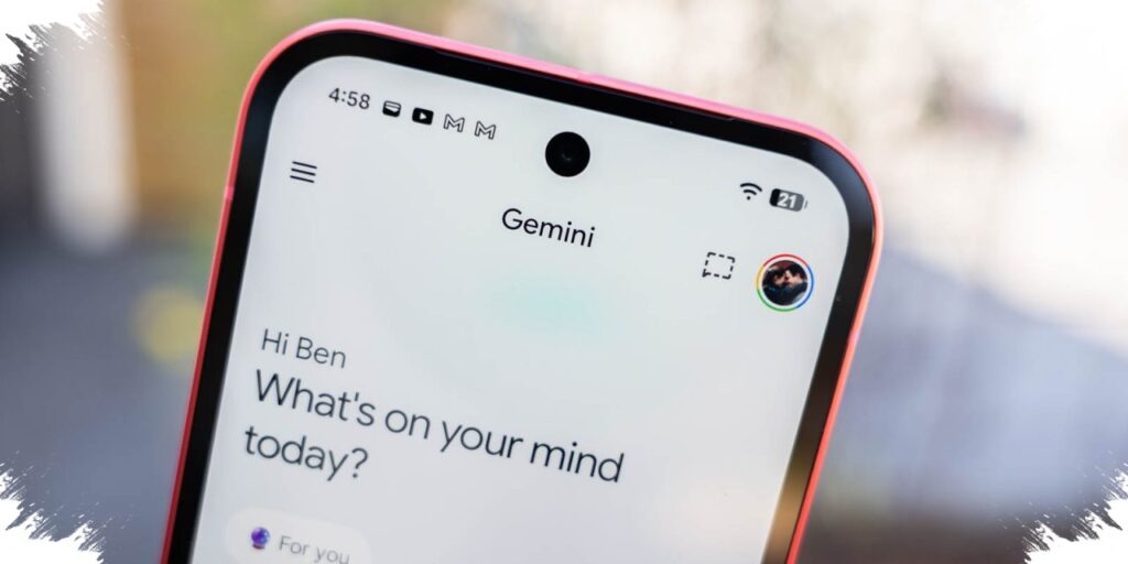
Google is reshaping Gemini on iPhone in a way that goes beyond a simple visual refresh. The latest changes make the app’s main actions easier to reach from the home screen, especially for users who want to search, upload files, or switch into other work modes quickly.
The most visible update appears at the start of the app. Gemini now opens with an animated background and layered visual elements around the search box, giving the interface a fuller look than before while still keeping attention centered on search.
A new role for the plus button
The biggest functional shift is tied to the plus (+) button. Instead of offering a limited set of choices, it now opens a broader menu that gathers many key actions in one place.
From that menu, users can jump to image tools, camera input, music, canvas, deep research, guided learning, and a “more uploads” tab. That last option is said to support files and resources from NotebookLM.
This redesign suggests that Google is making Gemini less dependent on plain text input. The app now pushes users toward a wider set of formats and tools, which makes the mobile experience feel more flexible and more directly tied to different tasks.
A stronger push toward multimodal use
The inclusion of camera and image options makes the app feel more immediate on a phone. At the same time, music, canvas, and deep research show that Gemini is being prepared for use cases that extend well beyond simple question-and-answer interactions.
Guided learning also stands out as part of that shift. It points to a product direction that is not limited to productivity alone, but also includes exploration and learning.
The “more uploads” section adds another layer to that idea by bringing NotebookLM-related files and resources into the same flow. That creates a more connected experience across Google’s AI tools, especially for users moving between different kinds of work.
Liquid Glass styling arrives on iOS
On iPhone, the update also introduces Liquid Glass design elements. The semi-transparent look gives the interface a lighter and more modern appearance, and it fits more closely with Apple’s current design language.
Even with that visual update, the main story remains about access. The new home screen treatment and the expanded plus menu both appear aimed at making Gemini faster to use and easier to navigate from the first tap.
The animated backdrop on the home screen is more than decoration. It helps strengthen Gemini’s visual identity while keeping the search area in focus, so the app still feels centered on the main action users are expected to take.
Rolling out in stages
The new interface is only available to some iOS users for now. That means the updated look will not appear everywhere at once, which is typical for a staged app rollout.
This approach gives Google room to check stability and watch early reactions before expanding availability further. There is no detailed timeline yet for other platforms, though the new design is expected to eventually reach Android as well.
For now, the iPhone update offers the clearest sign of where Gemini is heading. Google appears to be refining the app so it feels more visual, more immediate, and more tightly connected to the company’s wider set of AI tools.