A small interface shift on Pixel Watch is enough to disrupt a habit many users have built without thinking. Google has quietly changed the incoming call screen in Wear OS, moving the answer and reject controls away from the place many owners have learned to tap first.
The change does not affect the basic calling function, but it does alter the way the screen is arranged. For people who answer calls directly from a smartwatch, that matters because speed and touch accuracy depend heavily on where the controls sit.
Controls have moved to a new layout
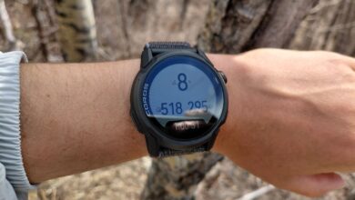
Google has redesigned the incoming call interface by placing the “answer” and “reject” buttons beside the contact photo. On earlier Pixel Watch layouts, the answer control sat at the bottom of the screen, which made that area the default reflex point for many users.
That familiar bottom placement is gone in the new design. The two main buttons now frame the caller image, while the overflow button that holds extra options, including replying with text, has been moved to the bottom of the screen.
The result is a screen that puts more emphasis on the caller’s identity at the center. Visually, the arrangement feels more balanced, but it also shifts the touch targets away from the position users may have memorized.
Why the change may feel awkward at first
For anyone who frequently takes calls on a watch, even a small redesign can create friction. Muscle memory often drives the first touch, so a moved button can easily lead to a misplaced tap during the first few days of use.
That effect is likely to be strongest for users who rely on the watch as a fast call filter. The controls still do the same job, but the interaction now asks people to relearn where the important buttons live on the display.
On a smartwatch, a tiny change in layout can matter more than it would on a larger screen. The device is used in quick, glance-based moments, so a shift of only a small distance can be enough to make the experience feel unfamiliar.
The rollout is not yet universal
Android Authority says the new interface has only appeared on some Pixel Watch devices so far. The distribution appears to be gradual, which means not every user will see the updated layout at the same time.
That also means some Pixel Watch owners will still encounter the older incoming call screen for now. Even so, the signs point to a broader rollout later, with the redesigned layout likely intended for more devices.
Possible link to Calling Cards
The new arrangement also appears to line up with support for Calling Cards. The comparison between the older screen, the newer screen, and another version that already includes a Calling Card suggests that the visual update may be tied to that feature.
Calling Cards seem designed to make contact identity more prominent during calls. That would help explain why Google moved the buttons to sit around the photo or card in the center of the screen.
For now, the core behavior remains unchanged. Users can still answer, reject, or open additional options, but they need to adjust to a different touch map than the one they have used before.
Source: www.androidauthority.com