Wallpaper on an iPhone has become more than a decorative layer. In iOS 26, Apple gives users more room to shape the look of both the Lock Screen and the Home Screen, making small visual tweaks feel surprisingly impactful.
That flexibility opens the door to several wallpaper approaches that can change the device’s overall mood without touching the system itself. From monochrome contrasts to spatial depth, the available tricks can make an iPhone look cleaner, more dynamic, and more personal.
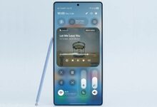
Spatial 3D is the most striking option
Among the available styles, spatial wallpaper stands out as the most attention-grabbing. Apple’s spatial scene feature creates a sense of depth and motion, so the wallpaper appears more immersive when the device is moved.
Users can choose a spatial wallpaper from the photo gallery or get one from a trusted source, then enable the spatial scene setting during wallpaper setup. Adjusting the zoom and the clock position can help the depth effect appear more pronounced.
The result is not just a background image. The wallpaper feels interactive, and the dimensional effect is hard to ignore during regular iPhone use.
A black-and-white Lock Screen can sharpen the look
Another approach uses the same photo on both screens, but treats them differently. The Lock Screen can be switched to monochrome while the Home Screen keeps its original color, creating a clear visual divide.
This contrast gives the Lock Screen a stronger, more defined appearance. At the same time, the colored Home Screen preserves a livelier feel, so the transition between the two screens stays smooth but distinct.
Complementary wallpapers can do the organizing work
Not every user wants identical images across both screens. Complementary wallpaper pairs can deliver a more balanced result because the Lock Screen and Home Screen are designed to feel connected rather than duplicated.
Search terms such as “paired iPhone wallpapers” can help users find matching sets, and apps like Wallcraft are also mentioned as possible sources. Minimalist, abstract, and nature themes are commonly chosen because they create a more seamless visual transition.
This method helps the phone look more structured. Instead of feeling like two unrelated designs, the home and lock displays form one visual identity.
Framed designs help highlight what matters
Framed wallpaper offers a different kind of benefit by making important screen elements easier to read. The design usually relies on borders or careful composition so that the clock and notifications remain visible and not lost in the background.
Searching for “frame iPhone wallpapers” can help users locate suitable options. From there, the color palette and placement of details can be matched to the rest of the theme.
The value of this style is not only decorative. It also guides attention to the key parts of the Lock Screen, which helps the layout feel cleaner and more orderly.
Live wallpaper adds movement without a full redesign
For users who want more motion, iOS 26 also supports a livelier look through video-based live wallpaper. Compared with static images, a short clip can make the Lock Screen feel more active and less repetitive.
The process is fairly simple, as video-to-live-wallpaper apps from the App Store can convert footage from the gallery into a wallpaper. Users can trim the duration, adjust the zoom, and save the result as a moving wallpaper.
Once applied, the wallpaper can show brief motion when the screen is activated. That makes the iPhone feel more expressive without requiring changes to other visual elements.
Choosing the right style depends on the user’s priority
Each wallpaper trick serves a different purpose. Monochrome looks suit users who prefer simplicity, live wallpaper brings motion, and complementary or framed designs work better for those who care about neatness and structure.
Spatial 3D remains the most visually pronounced choice for users who want to make full use of the iOS 26 wallpaper features. In practice, combinations are also possible, such as using a framed wallpaper on the Lock Screen and a colored wallpaper on the Home Screen to keep the design consistent.
The final result depends on the image selection and the small details, including zoom, filters, and element placement. With the right setup, wallpaper in iOS 26 becomes a central part of the iPhone’s visual identity rather than a simple background.
Source: www.geeky-gadgets.com