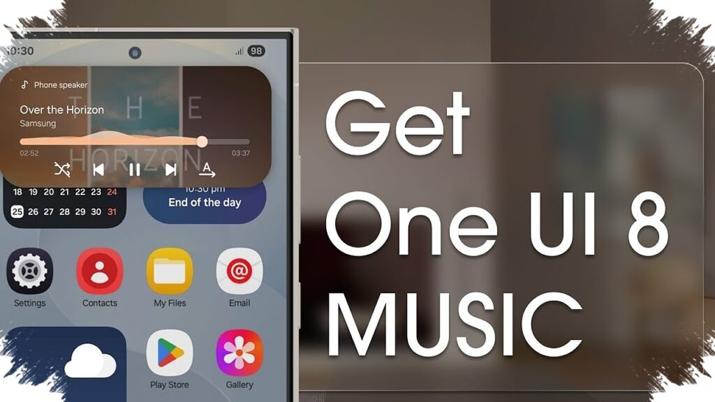
Samsung Music is finally getting a visual update that brings it closer to the rest of Samsung’s One UI experience. In One UI 8.5, the built-in music app’s widget appears with a cleaner, more modern look that matches Samsung’s latest design direction.
This change matters because several other Samsung apps had already moved to a softer, more rounded widget style starting with One UI 7, while Samsung Music remained behind for quite a while. With version 16.2.44.0, that mismatch is now starting to disappear.
A more consistent look on the home screen
According to SammyGuru, the updated Samsung Music widget now follows the broader visual language used across One UI. The refresh is not limited to the widget alone, since the app icon is also reported to have been redesigned so it looks more in line with other Samsung apps.
That alignment makes Samsung Music feel less isolated when placed on the home screen. Before this update, its older widget style stood out in a way that made it look different from the rest of Samsung’s interface elements.
What changes in the new widget
The most obvious adjustment is the shape. The widget now uses more rounded corners, a design choice that fits the cleaner and softer look Samsung has been pushing across recent One UI updates.
Samsung also appears to have expanded the widget size options, giving users more flexibility in how they arrange their home screens. The reported sizes include:
- 2×2
- 2×3
- 4×1
These options make it easier to choose between a compact layout and a wider widget that shows more controls at a glance.
The new opacity control stands out
The most notable addition is found on the 4×1 widget. Samsung has added an opacity slider with 10 levels, allowing the widget to blend more naturally with the wallpaper and overall home screen theme.
Lower opacity settings create a blurrier and cleaner look, while higher opacity makes the background more visible. At the lowest setting, the widget can even become transparent, which gives users more room to match the widget with their preferred setup.
Why this update matters for Samsung users
Music widgets are not new, but design consistency has become a larger part of the user experience. Since the home screen is one of the most frequently seen parts of a phone, even small details like corner radius and transparency can affect how polished the device feels.
Samsung has been steadily refining its stock apps to better match the latest One UI identity. The Samsung Music update fits that pattern and helps close a long-standing gap between the app and Samsung’s broader visual style.
Key details at a glance
| Item | Details |
|---|---|
| Related version | 16.2.44.0 |
| Widget style | Matches the new One UI look |
| App icon | Refreshed |
| Widget sizes | 2×2, 2×3, 4×1 |
| Extra feature | 10-level opacity slider on 4×1 widget |
The update does not change how Samsung Music works at its core, but it does make the app feel more polished and better integrated with modern Samsung phones. For users who care about a consistent home screen layout, the refreshed widget is a welcome fix that brings Samsung Music closer to the rest of the One UI ecosystem.
Source: sammyguru.com