
Google is giving Search Live a much-needed visual overhaul, and the change is aimed at making its AI search experience feel far more present on screen. The update shifts the interface toward a full-screen layout, replacing the heavier, space-consuming look that has long kept the feature from standing out.
That matters because Search Live has not had the same visibility as other Google AI experiences such as Gemini Live. Even as the feature continues expanding to more regions, its design has made it easy to overlook, both in the app and within Google’s broader search experience.
A cleaner layout for voice and video
Search Live is built around natural conversation, using both voice and video to handle queries in a more interactive way. The idea is similar to Gemini Live, although Google positions the two for different purposes.
The redesign appears in Google app version 17.20, according to 9to5Google. It has not rolled out evenly, though, and some Pixel devices on the same version still do not show the updated interface.
The biggest shift is how the feature uses the screen. Instead of occupying only part of the display, the new version stretches across the full screen and creates a cleaner visual field. That is especially noticeable when video is active, since the older layout left the lower portion of the screen feeling crowded.
Visual elements are being simplified
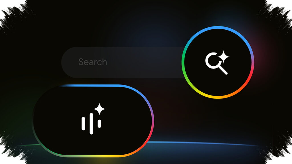
Google is also removing the large arc-shaped waveform that used to drop down while the system responded to a question. In its place, the company is using a smoother visual treatment that runs along the edge of the display.
On the opening screen, where users see the prompt “Try saying,” the border appears in a light blue frame. Once Search Live starts responding, the colors become more dynamic, and one visible version shows green and yellow tones along the bottom of the screen.
It is not yet clear whether Google plans to add more color options. Still, the updated look gives Search Live a more modern feel and makes it resemble Circle to Search more closely than before.
The core controls stay where users expect them
Even with the new appearance, Google is not reshaping the basic navigation. The company appears to be keeping the control layout familiar so existing users can move through the feature without relearning it.
At the top right, the same three buttons remain available for closed captions, the three-dot menu with settings and search history, and the exit option. Along the bottom, the Mute or Unmute, Video, and Transcript controls stay in place.
The “Tap to interrupt” prompt is still part of the interface as well. So are the thumbs-up and thumbs-down buttons used to rate response quality.
Visibility is still the bigger challenge
The redesign helps, but Search Live still has a discoverability problem. The feature is not yet one of the most obvious parts of Google’s interface, which means many users may not notice it or may not use it regularly.
On Pixel devices, Search Live can be opened by tapping the Lens icon in the home screen widget and then swiping to the Live tab. It is also available under the search bar inside the Google app.
Those access points are functional, but they are not especially simple for mass use. With global expansion already underway and a cleaner interface now in testing, Search Live may finally have a better chance to become a more visible part of Google’s AI search tools.