Netflix is changing how people browse for something to watch on mobile, and the newest update puts short video previews at the center of that experience. Instead of relying mainly on posters and written summaries, the app now surfaces a vertical feed of Clips that makes discovery feel faster and more visual.
The shift matters because many viewers still need more than a long trailer or a block of text to decide whether a title is worth opening. By turning the search process into a short-scroll format, Netflix is aiming to make mobile browsing feel closer to the way people already consume short-form video.
A feed built for quick discovery
Clips brings short excerpts from series, films, and specials directly into the mobile app. Users can keep scrolling through these previews much like they would move through a short-video feed on other platforms.
Netflix says the clips shown in the feed will be tailored to each user’s taste. That approach is meant to surface more relevant titles without forcing people to open multiple detail pages one by one.
The format is visually similar to Instagram Reels and YouTube Shorts, but the entire path stays inside Netflix’s own catalog. That means the focus is not on general entertainment clips, but on helping users find something to watch within the streaming service itself.
From preview to watch page
The new browsing flow does not stop at passive viewing. When a clip catches attention, users can move deeper into the title through the shortcuts built into the interface.
Netflix has also added an option to save titles to My List. That gives viewers a simple way to mark a movie or series for later without having to search for it again.
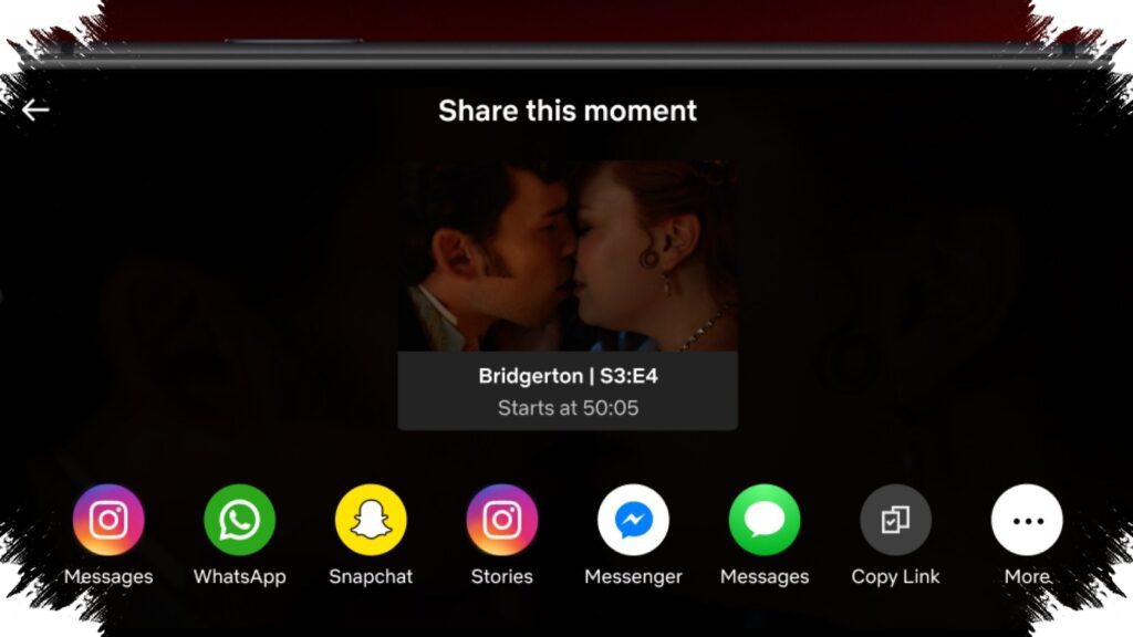
Clips can also be shared to social platforms, including WhatsApp and Instagram. On mobile, Netflix also allows clips to be posted directly to Instagram Stories from within the app.
If a viewer is ready to watch, the app provides a direct path to the title’s page through the thumbnail in the lower-right corner. The design is meant to reduce the gap between discovery and playback.
Mobile navigation gets a new layout
The arrival of Clips comes with a redesigned mobile interface that puts the feature at the bottom of the app. That placement makes it one of the main navigation points in Netflix’s mobile experience.
At the top, menus such as Shows, Movies, New & Hot, and Categories now appear in a refreshed layout as well. Netflix says the new arrangement is designed to bring the most important elements forward and make the app feel more compact on a phone screen.
The update follows a larger design overhaul that had already reached the smart TV app earlier since May last year. Netflix also outlined a similar mobile redesign earlier this month when it discussed first-quarter earnings, and the rollout is now beginning to take shape.
Where the update is live
The mobile update is already available in India, the US, the UK, Australia, Canada, Malaysia, Pakistan, the Philippines, and South Africa. Netflix says the same experience will expand to other regions around the world in the coming months.
The broader direction is clear: Netflix wants mobile browsing to feel as immediate as scrolling through short video content. In a large catalog, the challenge is not just offering more titles, but helping users decide quickly which one deserves attention.
Clips is designed to answer that problem by giving viewers a faster sense of a title’s tone, style, and pacing. For Netflix, that could make mobile usage more active and move users from browsing to watching with fewer steps.