
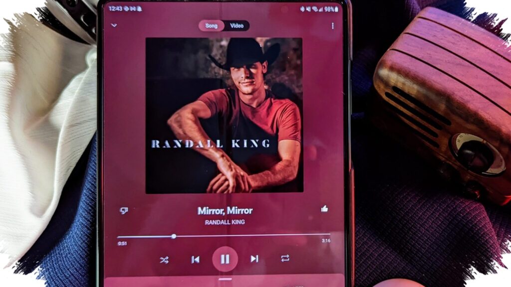
YouTube Music is rolling out a redesigned Now Playing screen that puts the Up Next queue in a much more visible position. The change is starting to reach more users, and reports from Reddit posts, backed by 9to5Google, suggest the new interface is appearing on Pixel devices as the rollout expands beyond a small test group.
The update makes the queue feel less like a supporting panel and more like the main control center while music is playing. Up Next now takes up more space on the player page, giving listeners a clearer view of what is coming after the current track.
Up Next becomes the main focus
The biggest shift in the new layout is how prominently YouTube Music presents the next-song queue. Instead of being tucked away as a secondary element, Up Next now sits at the center of the playback experience, making it easier to scan the upcoming lineup at a glance.
The interface also supports swiping up or down to move between a separate view and a full-screen layout that includes the next queue list. That makes the queue more directly tied to navigation while listening, rather than leaving it as an extra panel that users only open occasionally.
Lyrics move closer, Related moves farther away
YouTube Music also changed where the Lyrics button appears. In the new design, it sits closer to the like and dislike controls, which should make lyric access faster during playback.
At the same time, the Related section is less exposed than before. It is still available, but users now need to tap the song name from the Now Playing screen to find it. That creates a cleaner layout, although it is also a less direct path for people who frequently switch between the current track and related content.
Song and Video switcher stays, but only as an icon
Another familiar part of the player remains in place: the Song/Video switcher. The difference is that YouTube Music has replaced the text label with an icon, which changes how quickly the control can be recognized.
That small visual adjustment may take some getting used to, especially for users who relied on the clearer text-based version. The source notes that the older labeling was easier to identify, particularly for people who are not yet familiar with the newer symbol.
Split view loses some of its extras
The redesign also affects the split view that shows Now Playing and Up Next side by side. In that layout, several shortcuts that were previously available are no longer shown as fully as before, including like and dislike, Lyrics, Comments, and other items.
Even with that cleanup, the core playback controls remain easy to reach. Play, pause, and track skipping are still available quickly, so the redesign changes the arrangement more than the basic function of the player.
Server-side rollout means not everyone needs a new app version
For users who have not seen the redesign yet, manually updating the app may not be the key requirement. The change is reportedly being delivered through a server-side rollout, which means the new interface can appear without installing a fresh app version.
A force close and relaunch may help trigger the new layout on devices that have already been included in the rollout wave. The report also says the updated design now appears to be finished for YouTube Music on iOS, showing that the change is not limited to Android.
A long-running test is finally reaching more devices
YouTube Music has been testing this version of the Now Playing screen since it first surfaced near the end of 2024. It has shown up several times in limited form since then, with minor revisions each time it reappeared.
In December, the return of the Song/Video switcher led some to think a wider launch was close. The broader rollout, however, only became visible after nearly four months passed following that signal.
Overall, the redesign is not a dramatic departure from earlier test versions, but it does show a clear direction. By making Up Next more central, moving Lyrics into easier reach, and pushing Related further out of sight, YouTube Music is steering the playback screen toward queue-first navigation.